©Richard Lowry, 1999-
All rights reserved.
Chapter 3. Introduction to Linear Correlation and Regression
Part 3
[Traducción en español]
Regression
The appearance of the term regression at this point (literally, backward movement) is something of an historical accident. It could just as easily have been called progression. The basic concept is the same we found for correlation, though now it has added into it the visual imagery of movement— essentially, of two things, two variables, moving together. As indicated earlier, correlation and regression are two sides of the same statistical coin. When you measure the linear correlation of two variables, what you are in effect doing is laying out a straight line that best fits the average "together-movement" of these two variables. That line is spoken of as the line of regression, and its utility is not only as a device for helping us to visualize the relationship between the two variables. It can also serve very usefully as a basis for making rational predictions.
To illustrate, consider again our 1993 SAT correlation. Assuming that the negative correlation for that year is likely to occur in subsequent years, you are now in a position to predict a state's average SAT score for some subsequent year, before the results are reported, simply on the basis of knowing the percentage of students within the state who take the SAT that year.
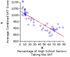
If 10% of the high school seniors within a state take the SAT, it is a fairly safe bet that the average combined SAT score for that state will be somewhere in the vicinity of 1,010—perhaps a bit higher or lower, but in any event somewhere in the vicinity. If 70% of the high school seniors in some other state take the SAT, it is a fairly safe bet that the average for that state will be nowhere near 1,010, but rather somewhere in the vicinity of 880. Regression analysis provides a rational foundation for making such predictions; it also provides a basis for specifying precisely what we mean by "somewhere in the vicinity."
As we noted earlier, when you perform the computational procedures for linear correlation and regression, what you are essentially doing is defining the straight line that best fits the bivariate distribution of data points. The criterion for "best fit" is that the sum of the squared vertical distances between the data points and the regression line must be as small as possible. The slant of the resulting line will correspond to the direction of correlation(upward, +; downward, —); and the tightness of the data points around the line will correspond to the strength of the correlation. You can think of the regression line as representing the average relationship that exists between X and Y, as observed within this particular sample.
The location and orientation of the regression line are defined by two quantities, spoken of as regression constants, that can be easily derived from the results of calculations already performed in Table 3.2. These are
The computational formulas for these two quantities are quite simple and can be introduced without elaborate comment:
Before we perform these calculations for the SAT data, I think it might be useful to illustrate the process with a simpler data set. For this purpose, consider yet again the pairing of Xi and Yi values that produced the positive correlation shown in Example II of Figure 3.3.
Given these previously calculated values:
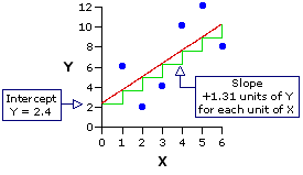
In the following graph I show the same figure that appears above, but now constructed in such a way as to emphasize the intercept and slope of the regression line. The intercept, shown on the left-hand side of the graph, is the point at which the regression line crosses the vertical Y axis—providing that the Y axis is lined up with the point on the horizontal axis where X is equal to zero. (Be careful with this, because scatter plots do not always begin the X axisat X=0.) The slope of the regression line is indicated by the green pattern in the graph that looks like a flight of stairs. What this pattern shows is that for each increase of one unit in the value of X, the value of Y increases by 1.31 units. Thus, when X is equal to zero, Y is equal to the intercept, which is 2.4; when X=1.0, Y is equal to the intercept plus 1.31 (i.e., 2.4+1.31=3.71); when X=2.0, Y is equal to the intercept plus 2.62 (i.e., 2.4+2.62=5.02); and so on.
Now we perform the same calculations for the data set of our 1993 SAT correlation. In Table 3.2 we have already arrived at the summary values
Given these values, the slope of the regression line can be calculated as
and the intercept as
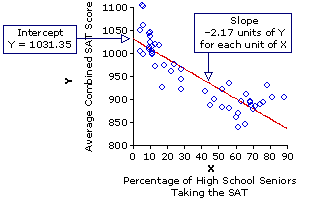
For this data set, the regression line intercepts the vertical axis at the point where Y is equal to 1031.35, and then slants downward(—) 2.17 units of Y for each unit of X. Thus, when X is equal to zero, Y is equal to 1031.35; when X=10, Y is equal to the intercept minus 2.17x10 (i.e., 1031.35—21.7=1009.65); when X=20, Y is equal to the intercept minus 2.17x20 (i.e., 1031.35—43.4=987.95); and so on.
These are the mechanics of regression in a nutshell; now to the logic and strategy of prediction. If the observed correlation between two variables, X and Y, proves to be statistically significant—unlikely to have occurred through mere chance coincidence—the rational presumption is that it pertains not just to this particular sample of XiYi pairs, but to the relationship between X and Y in general. And once you know the relationship between X and Y in general, you are then in a position to figure out the value of Yi that is likely to be associated with any particular newly observed value of Xi. The procedure for making such a prediction is illustrated pictorially below.
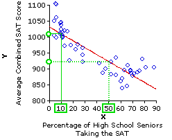
From the observed correlation in this 1993 sample, we infer that the general relationship between X and Y can be described by a regression line that has an intercept ofa=1,031.35 and a slope of b=—2.17. Suppose, now, that for some subsequent year a certain state has Xi=10% of its high school seniors taking the SAT. If you wanted to predict Yi, the average SAT score for that state, the obvious way to proceed would be to start with the observed value of Xi=10%, go straight up to the line of regression, and then turn left to see where you end up on the Y axis. That will be your predicted value of Yi, which as you can see from the graph is something quite close to Y=1,010. For Xi=50%, on the other hand, the predicted value is in the vicinity of Y=925.
In practice, of course, the predicted values of Yi are not arrived at graphically, but through calculation. For any particular observed linear correlation between two variables, X and Y, the value of Yi to be predicted on the basis of a newly observed value of Xi is given by the following formula. Please note, however, that this version of the formula is only preliminary. There is something we will need to add to it a bit later.
predicted Yi = a + bXi
Try this formula out with a few different values of Xi and you will see that it is arriving mathematically, hence more precisely, at the same result that would be reached through the graphical method shown above. The formula does it by starting at a, the point at which the regression line intercepts the Y axis, and then moving up or down the Y axis (depending on the direction of the correlation) one unit ofslope (b) for each unit of X.
Now we are of course not claiming for either of these cases that the actual values of Yi will fall precisely at the points we have calculated. All we can rationally assert is that actual values of Yi for the case whereXi=10% will tend to approximate the predicted regression-line value of 1,009.65; that actual values of Yi for the case where Xi=50% will tend to approximate the predicted regression-line value of 922.85; and so on for any other values of Xi that fall within the range of Xi values observed within the sample. It will probably be intuitively obvious to you that the strength of this "tendency to approximate" will be determined by the strength of the correlation observed within the original sample: The stronger the observed correlation, the more closely the actual values of Yi will tend to approximate their predicted values; and conversely, the weaker the correlation, the greater will be the tendency of the actual values of Yi to deviate from their predicted values. A moment ago I indicated that the formula for a predicted value of Yi
predicted Yi = a + bXi
needs to have something added to it. What needs to be added is a measure of probable error, something that reflects the strength of the observed correlation, hence the strength of the tendency for actual values of Yi to approximate their predicted values. Although the full conceptual background for this step will not be available until we have covered some basic concepts of probability, it is possible at this point to convey at least a practical working knowledge of it. Within the context of linear regression, the measure of probable error is a quantity spoken of as the standard error of estimate. Essentially, it is a kind of standard deviation. Here again is the scatter plot for the 1993 SAT correlation.
In your mind's eye, please try to envision a green line extending straight up or straight down from each of the blue data points to the red regression line. Each of these imaginary green lines is a measure of the degree to which the associated data point deviates (along the Y axis) from the regression line. Square each of these distances, then take the sum of those squares, and you will have a sum of squared deviates. In statistical parlance, each deviate (the imaginary green line) is spoken of as a residual, so the sum of their squares can be denoted as the sum of squared residuals, which we will abbreviate as SSresidual. At any rate, divide this sum of squared deviates (residuals) by N, and you will have a variance. Take the square root of that variance, and you will have a standard deviation.
As it happens, the sum of squared residuals can be arrived at mathematically through the simple formula
For the 1993 SAT example, this yields
Divide this quantity by N, and you will have the residual variance of Y:
60,184.38/50=1,203.69.
Take the square root of it, and you will have the standard deviation of the residuals:
sqrt[1,203.69]=±34.69
This standard deviation of the residuals is almost, but not quite, equivalent to the standard error of estimate. The difference is that the quantity we have just calculated is purely descriptive—it pertains only to this particular sample of paired XiYi values—whereas the standard error of estimate aims to reach beyond the sample into the realm of events as yet unobserved. This extension—from the particular sample of XiYi pairs to the relationship between X and Y in general—is achieved through the simple expedient of dividing SSresidual byN—2 rather than by N. The rationale for this N—2 denominator will have to wait until a later chapter. For the moment, suffice it to say that the standard error of estimate, which we will abbreviate as SE, is given by the formula
SE = sqrt[(SSresidual) / (N—2)]
For the present example, our standard error of estimate is therefore
SE = sqrt[60,184.38 / (50—2)]=±35.41
In brief: On the basis of what we have observed within our sample of XiYi pairs, we estimate that if the regression line of the sample were to be applied to the entire population of XiYi pairs, the Y residuals of the population would have a standard deviation somewhere very close to±35.41.
The next version of the SAT scatter plot shows how all of this applies to the task of prediction. A parallel line drawn 35.41 units of Y above the regression line will give you+1 standard error of estimate; one drawn 35.41 units of Y below the regression line will give —1 standard error of estimate; and the inference (details in a later chapter) is that the range between +1SE and —1SE will include approximately two-thirds of all the XiYi pairs within the population. Thus, when you predict an unknown value of Yi according to the formula
predicted Yi = a + bXi
the true value of Yi has about a two-thirds chance of falling within plus-or-minus 35.41 points of your predicted value, that is, within plus-or-minus 1 standard error of estimate. In making predictions of this type, the convention is to state the predicted value not simply as
predicted Yi = a + bXi
but rather as 'predicted Y' plus-or-minus 1 standard error of estimate. That is
predicted Yi = a + bXi±SE
Thus, our predicted state average SAT scores for the cases where 10% and 50% of a state's high school seniors take the test are, in their full form
That is, forXi=10% we predict that the corresponding value of Yi has a two-thirds chance of falling between Y=974.24 and Y=1,045.06; for Xi=50%, we predict that the corresponding value of Yi has a two-thirds chance of falling between Y=887.44 and Y=958.26; and so on. Providing that the sample is adequately representative of the relationship between X and Y in general, we can expect approximately two-thirds of the entire 'population' of XiYi pairs to fall within the range defined by plus-or-minus 1 standard error of estimate, and only about one-third to fall outside that range. Hence, any particular prediction of the general form
predicted Yi = a + bXi±SE
will have about a two-thirds chance of catching the true value of Yi in its net and only a one-third chance of missing it. Another way of expressing this concept is in terms of confidence. For a linear-regression prediction of this general form, you can be about two-thirds confident that the true value of Yi will fall within±1SE of the predicted value. In a later chapter we will examine procedures by which you can increase the confidence you might have in an estimate or a prediction to much higher levels such as 95% or 99%.
But the proof, as they say, is in the pudding. If you examine the SAT data for any testing year subsequent to 1993, you will find that about two-thirds of the actual values of Yi do in fact fall within the range defined by the regression line of the 1993 sample, plus-or-minus 1SE. Hence any particular prediction of the form
predicted Yi = a + bXi±SE
would have had about a two-thirds chance of falling within the net.
In Part 2 of this chapter we noted briefly that the first question to be asked of an observed correlation is whether it comes from anything other than mere chance coincidence. It is now time to take that question up in greater depth; however, as it is a question whose implications extend far beyond the confines of correlation and regression, we will make it a separate chapter.T
End of Chapter 3.To illustrate, consider again our 1993 SAT correlation. Assuming that the negative correlation for that year is likely to occur in subsequent years, you are now in a position to predict a state's average SAT score for some subsequent year, before the results are reported, simply on the basis of knowing the percentage of students within the state who take the SAT that year.
If 10% of the high school seniors within a state take the SAT, it is a fairly safe bet that the average combined SAT score for that state will be somewhere in the vicinity of 1,010—perhaps a bit higher or lower, but in any event somewhere in the vicinity. If 70% of the high school seniors in some other state take the SAT, it is a fairly safe bet that the average for that state will be nowhere near 1,010, but rather somewhere in the vicinity of 880. Regression analysis provides a rational foundation for making such predictions; it also provides a basis for specifying precisely what we mean by "somewhere in the vicinity."
As we noted earlier, when you perform the computational procedures for linear correlation and regression, what you are essentially doing is defining the straight line that best fits the bivariate distribution of data points. The criterion for "best fit" is that the sum of the squared vertical distances between the data points and the regression line must be as small as possible. The slant of the resulting line will correspond to the direction of correlation
The location and orientation of the regression line are defined by two quantities, spoken of as regression constants, that can be easily derived from the results of calculations already performed in Table 3.2. These are
| a = | the point at which the line crosses the Y axis (the 'intercept'); and
| b =
| the rate at which the line angles upward or downward along the X axis (the 'slope').
| |
The computational formulas for these two quantities are quite simple and can be introduced without elaborate comment:
For the slope:
|
|
|
| b =
| SCXY | SSX
|
| | ||||
and for the intercept:
|
|
|
| a = MY — bMX
|
|
| | |
Before we perform these calculations for the SAT data, I think it might be useful to illustrate the process with a simpler data set. For this purpose, consider yet again the pairing of Xi and Yi values that produced the positive correlation shown in Example II of Figure 3.3.
|
Pair | Xi | Yi | 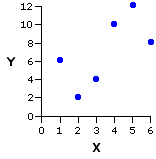
| ||||||
| a b c d e f | 1 2 3 4 5 6 | 6 2 4 10 12 8 means | 3.5 | 7.0 |
SSX = 17.5 | SSY = 70.0 SCXY = 23.0 | |||
Given these previously calculated values:
slope:
| b =
| SCXY | SSX =
| 23.0 | 17.5 = +1.31
|
|
| | ||||||||
intercept:
| a
| = MY — bMX= 7.0 — [1.31(3.5)] = 2.4
| | |||||||
In the following graph I show the same figure that appears above, but now constructed in such a way as to emphasize the intercept and slope of the regression line. The intercept, shown on the left-hand side of the graph, is the point at which the regression line crosses the vertical Y axis—providing that the Y axis is lined up with the point on the horizontal axis where X is equal to zero. (Be careful with this, because scatter plots do not always begin the X axis
Now we perform the same calculations for the data set of our 1993 SAT correlation. In Table 3.2 we have already arrived at the summary values
|
mean of X = 36.32 mean of Y = 952.54 SSX = 36,764.88 SSY = 231,478.42 SCXY = —79627.64 | X = percentage of high school seniors taking the SAT Y = state average combined SAT score |
Given these values, the slope of the regression line can be calculated as
| b = | SCXY SSX | = | .—79627.64 36,764.88 | = —2.17
|
| | ||||||||
| a | = MY — bMX = 952.54 — [—2.17(36.32)] = 1031.35
| | |||
For this data set, the regression line intercepts the vertical axis at the point where Y is equal to 1031.35, and then slants downward
These are the mechanics of regression in a nutshell; now to the logic and strategy of prediction. If the observed correlation between two variables, X and Y, proves to be statistically significant—unlikely to have occurred through mere chance coincidence—the rational presumption is that it pertains not just to this particular sample of XiYi pairs, but to the relationship between X and Y in general. And once you know the relationship between X and Y in general, you are then in a position to figure out the value of Yi that is likely to be associated with any particular newly observed value of Xi. The procedure for making such a prediction is illustrated pictorially below.
From the observed correlation in this 1993 sample, we infer that the general relationship between X and Y can be described by a regression line that has an intercept of
In practice, of course, the predicted values of Yi are not arrived at graphically, but through calculation. For any particular observed linear correlation between two variables, X and Y, the value of Yi to be predicted on the basis of a newly observed value of Xi is given by the following formula. Please note, however, that this version of the formula is only preliminary. There is something we will need to add to it a bit later.
Try this formula out with a few different values of Xi and you will see that it is arriving mathematically, hence more precisely, at the same result that would be reached through the graphical method shown above. The formula does it by starting at a, the point at which the regression line intercepts the Y axis, and then moving up or down the Y axis (depending on the direction of the correlation) one unit of
for Xi = 10%
|
| predicted Yi
| = 1,031.35+(—2.17 x 10)
|
|
| = 1,009.65
| | ||
and for Xi = 50%
|
| predicted Yi
| = 1,031.35+(—2.17 x 50)
|
|
| = 922.85
| | ||
Now we are of course not claiming for either of these cases that the actual values of Yi will fall precisely at the points we have calculated. All we can rationally assert is that actual values of Yi for the case where
needs to have something added to it. What needs to be added is a measure of probable error, something that reflects the strength of the observed correlation, hence the strength of the tendency for actual values of Yi to approximate their predicted values. Although the full conceptual background for this step will not be available until we have covered some basic concepts of probability, it is possible at this point to convey at least a practical working knowledge of it. Within the context of linear regression, the measure of probable error is a quantity spoken of as the standard error of estimate. Essentially, it is a kind of standard deviation. Here again is the scatter plot for the 1993 SAT correlation.
In your mind's eye, please try to envision a green line extending straight up or straight down from each of the blue data points to the red regression line. Each of these imaginary green lines is a measure of the degree to which the associated data point deviates (along the Y axis) from the regression line. Square each of these distances, then take the sum of those squares, and you will have a sum of squared deviates. In statistical parlance, each deviate (the imaginary green line) is spoken of as a residual, so the sum of their squares can be denoted as the sum of squared residuals, which we will abbreviate as SSresidual. At any rate, divide this sum of squared deviates (residuals) by N, and you will have a variance. Take the square root of that variance, and you will have a standard deviation.
As it happens, the sum of squared residuals can be arrived at mathematically through the simple formula
| SSresidual=SSY x (1—r2) |
Recall that r2 is the proportion of variability in Y that is associated with variability in X, and that |
For the 1993 SAT example, this yields
| SSresidual | = 231,478.42 x (1—0.862)
|
|
| = 60,184.38
| |
Divide this quantity by N, and you will have the residual variance of Y:
Take the square root of it, and you will have the standard deviation of the residuals:
This standard deviation of the residuals is almost, but not quite, equivalent to the standard error of estimate. The difference is that the quantity we have just calculated is purely descriptive—it pertains only to this particular sample of paired XiYi values—whereas the standard error of estimate aims to reach beyond the sample into the realm of events as yet unobserved. This extension—from the particular sample of XiYi pairs to the relationship between X and Y in general—is achieved through the simple expedient of dividing SSresidual by
For the present example, our standard error of estimate is therefore
In brief: On the basis of what we have observed within our sample of XiYi pairs, we estimate that if the regression line of the sample were to be applied to the entire population of XiYi pairs, the Y residuals of the population would have a standard deviation somewhere very close to±35.41.
The next version of the SAT scatter plot shows how all of this applies to the task of prediction. A parallel line drawn 35.41 units of Y above the regression line will give you
the true value of Yi has about a two-thirds chance of falling within plus-or-minus 35.41 points of your predicted value, that is, within plus-or-minus 1 standard error of estimate. In making predictions of this type, the convention is to state the predicted value not simply as
but rather as 'predicted Y' plus-or-minus 1 standard error of estimate. That is
Thus, our predicted state average SAT scores for the cases where 10% and 50% of a state's high school seniors take the test are, in their full form
for Xi = 10%
|
| predicted Yi
| = 1,031.35+(—2.17 x 10)±35.41
|
|
| = 1,009.65±35.41
| | ||
and for Xi = 50%
|
| predicted Yi
| = 1,031.35+(—2.17 x 50)±35.41
|
|
| = 922.85±35.41
| | ||
That is, for
will have about a two-thirds chance of catching the true value of Yi in its net and only a one-third chance of missing it. Another way of expressing this concept is in terms of confidence. For a linear-regression prediction of this general form, you can be about two-thirds confident that the true value of Yi will fall within
But the proof, as they say, is in the pudding. If you examine the SAT data for any testing year subsequent to 1993, you will find that about two-thirds of the actual values of Yi do in fact fall within the range defined by the regression line of the 1993 sample, plus-or-minus 1SE. Hence any particular prediction of the form
would have had about a two-thirds chance of falling within the net.
In Part 2 of this chapter we noted briefly that the first question to be asked of an observed correlation is whether it comes from anything other than mere chance coincidence. It is now time to take that question up in greater depth; however, as it is a question whose implications extend far beyond the confines of correlation and regression, we will make it a separate chapter.T
|
*Note, however, that Chapter 3 also has two subchapters examining a couple of aspects of correlation not covered in the main body of the chapter. |
Return to Top of Chapter 3, Part 3
Go to Subchapter 3a [Partial Correlation]
Go to Subchapter 3b [Rank-
Go to Chapter 4 [A First Glance at the Question of Statistical Significance]
| Home | Click this link only if the present page does not appear in a frameset headed by the logo Concepts and Applications of Inferential Statistics |